
Deviation Actions


Description
So I did a small drawing out of it! Ahh, he looks so adorable, I want it so badly XD.
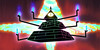
I adore the depth of colors and details in this piece. Bill’s galaxy form looks awesome and despite being turned solely to the front, he doesn’t look flat at all. Mostly the shadows do the trick, from the volume they give to his “bricks” to the shadow cast by his eyelashes. I wouldn’t say he’s adorable in this one, not even cute – he’s scowling and threatening, clearly meaning no games ans all business this time – he’s terrifying and I love it.
You made a great effect with the background, leaving it transparent but for the rift. It does look like Bill’s coming right out of the webpage. The fractals look a bit like tentacles, and the way they curl, combined with their spiky surface, makes it look like the dimension Bill’s coming from is a huge, hellish machine. The rift’s simple vector-like edges make for good contrast and the whole thing complements Bill’s bluish-purplish body.
I wish Bill’s arms and legs got the same, 3D-looking treatment. It’s visible that you did shade them, but the patches of light don’t blend into the rest, and instead of aiding, make his limbs look flat. I think it would have helped if you blended the highlights in a bit for a glossy effect similar to the one the bricks have.
The pose in which he holds his cane gives me mixed feelings. On one hand, it looks terribly uncomfortable, but on the other, it underscores just how angry Bill is – like he grabbed the cane in a haste, any way possible, ready to strike. If that’s the case, it works. What I don’t like about the cane, however, is that like the limbs, it looks more flat than cylindrical. Here’s a guide I found when doing an earlier critique, which explains the ways of shading cylindrical objects: ilikemarkers.blogspot.com/2009…
Despite these minor flaws, the piece is magnificent. It’s hard to stop staring at it, actually. Great job, keep it up!
I hope I was able to help and didn’t fall into the nitpicking pit. Good luck with your next pieces, and have merry CRITmas!